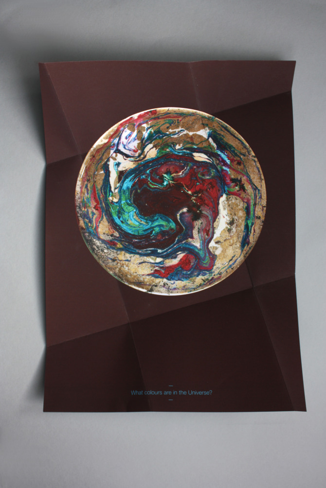
So this is the final version of the poster that I have been working on. I squished a lot of different coloured paints. Abstraction and music is a good mix.
Great article about a photographer who does some interesting work, searching through Google Maps streetview to present images of American life in a haunting way. It challenges the nature of photography and the photographer by recontextualising the photographs through the collection that Rickards has acquired. Suddenly these images have new meaning and made this kind of photography his own.
Looking for inspiration for a percussion poster that I'm doing and looking for some jazzy energetic colour combinations. I love the teal and the hot pink together. Also, the hand-generated type is amazing.
http://www.martinojanadesign.com/ They do some really great posters.
Trippy upside down stuff from Carl Kleiner, who also created the deconstructed food shoot for Ikea. Carl, if you're out there, can you come and help me clean up my room?
Saturday, December 10, 2011
It's hard to find nice-looking non-tacky Christmas cards, so it's refreshing to see something like this. From Not on the High Street.